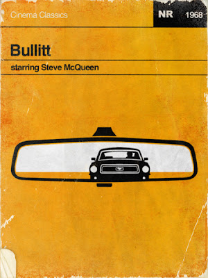
These are a selection of existing posters and concepts for films, although they are different genres to the content of my research, they are still very inspirational for my own design because the minimalist and simplistic approach is something I want to mimic with the visuals and placement of copy. I feel that the simplicity and stripped back approach presents the content and information clearly and easily to any audience. The visuals need to be instantly recognisable through a limited number of colours and shapes in order to have the minimalist look and feel this is achievable with the content I am using because each character has notable visuals to make them recognised needed for the younger audience to relate to them.


No comments:
Post a Comment