Wednesday 3 October 2012

Feedback.

Within small groups we presented our work over the summer and received feedback on the strengths and areas of improvements for both presentation skills and the visual products.

Strengths
  • Great illustrations 
  • Final products work really well for audience 
  • Good that looked at broad and final idea from all research
  • Fun topic 
  • Thought it through very well before going into another topic
  • Illustration are amazing 
  • Character design is fun and unique 
  • Good illustrations, very comical for kids 
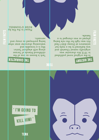
  • Nice fold out poster of characters with information of the character on the other side
  • Great to see the process and journey of the research
  • Large amount in-depth research interested with subject matter 
  • Took images and illustrated in your own way 

Areas of improvements 
  • Possibly include more history 
  • Include a little more info/facts within products depending on how much info is available 
  • Go bigger, go wild with the size and range 
  • Experiment with stock 
  • Grammar and proof read work before printing and finalising 

This was a great way to get back into the year and has given me a number of things to consider and take forward into the new modules. Areas of improvements such as experimenting with scale and stock are something that I really need to keep remembering moving forward as it can be applied to any brief and is a quick and easy consideration that could change the overall finish of my design massively. Although grammar and proof reading is an obvious suggestion it is something that I often forget or leave too late to sort out and fix, as my practice is stepping up a level now I'm in the second year this is essential to achieve more professionalism and higher quality. All something to consider moving forward.  

Thursday 27 September 2012

Presentation.

Plan

Slide 1
Title- Summer brief researching on Disney's Tarzan
Name

Slide 2
Talk about original theme of Florida

Slide 3
Developing into a focus of Disney

Slide 4
Originally going to be on theme parks and resorts
Primary photos of parks

Slide 5
Focus onto Disney animation and talk about why the choice of Tarzan

Slide 6
Examples of research carried out
Talk about this
Pick out interesting facts
Could span over a few slides

Last slide
Image of final practical outcome
Result of the research


Presentation


Script 
Florida admitted as US state in 1845
Semi tropical climate
One of the causes of hurricanes developing
Also looked into this before the other aspects of Florida's culture

Most obviously the Disney enterprise
Consists of mainly animation, theme parks, resorts and franchises

Lion King also released in 1994- biggest selling Disney animation

Primary photos taken a couple of years ago

Facts on Tarzan- why I chose the subject etc
Include interesting facts of release figures, animation techniques used and novel origins of story

New final outcomes.


I am pleased with the newer outcomes of my final solution ready for the upcoming crit and presentation. This is because I feel they are visually stronger than previously because the layout and grid is better resulting in neater and more readable and structured copy on the inner pages. Also by adding interest to the quote on the back improves the use of image and text on the piece and makes the text more illustrated reflecting the nature of the imagery. The use of the slanted and obscured alignment for the quote relates the copy more to the theme of the film and the idea of a jungle because it is more disorientated and rouged; reading is obscured much like visuals would be if travelling in the jungle. Although it is not conventional I have still made sure that the font style and size is clear to ease the reading for the younger audience I am targeting. The illustration style has remained the same throughout my development of the solution because I feel that this was the only element I was completely happy with anyway because it is appropriate for the audience and is still recognisable as the character as well as introducing this different and minimalist style I have been wanting to achieve throughout. The project as a whole has gone well and I have enjoyed been able to research into my own personal interests. Also finding out new information and a more in depth knowledge of the subject has been good because it has given me a new perspective on the film and the animation used within Disney's work and how this could be applied to their other works. There are many other avenues of enquiry that link closely to the theme of Tarzan that I didn't have time in the end to look into but if this research is to be used further into the modules in upcoming year I can confidently say that there is enough material to work with and more broader fields that could be explored to expand the work if needed. 

Re-visiting final outcomes.

When returning back to uni I discovered that the timetable had changed and therefore I had longer on the summer brief project before presenting it to the group, I felt that this was a great opportunity to re visit and re work the elements that I really wasn't happy with after my initial print out. This included the use of layout and grid with the copy on the inner pages as I can see that it needs to be more structured in order to be more legible for the younger audience. Another element of the visuals that was annoying me is how boring the back quote page looked and it visually appears like it was an after thought and a rushed design choice. Need to make it look a part of the animated and illustrated visual style but still keeping within a minimalist feel. 


My choice to use slanted copy was to give it a more animated feel and also feel it links well with the unorganised appearance of the jungle setting. Kind of swinging in across the page until finding a space to sit, similar to Tarzan on the vines in the film. Adds interest without losing legibility. To keep the leaflet appearing the same visually inside I repeated the boxed copy look on the titles for each section on the inner pages.


I was relatively happy with the layout used for the Tarzan leaflet as I felt it was highly legible and looked to have structure. Made minor tweaks to make sure each column was equal distance away from the edge, using the margins better. My main issue with the layout of copy was on the other 3 leaflets as felt this was very poor and in some cases the layout not considered at all. 


Again looked at making sure the margins were used well and no overlapping of copy onto the image as felt this would distract and confuse the younger audience too much. In some cases I removed parts of the information so that the overall visual appearance of the layout worked better and became more legible. 


Repeated the same layout and visual appearance across the other two leaflets to make sure that they were all highly readable and matched across the set. 


Monday 24 September 2012

Final outcomes.


I am pleased with the final outcomes for this brief especially considering the little amount of time that I ended up leaving myself for actual production of visuals. This was because of constrictions with working but should have been time managed better if I want to carry on working during the rest of the year, something I need to get round to make it work. The visual style uses the minimalist approach that I was inspired by and the hoped for simplicity has been achieved because the characters have been stripped back but are still easily recognisable. I have tried my best to overcome issues with layout but feel on some the content is too much and layout has been compromised in order to fit it on the page, so this is an element I can re look at if enough time. Another area that I am not happy with is the final production and cropping of the prints because this was rushed and has resulted in some copy being sliced and the characters not centrally aligned on the front page. Overall the new concept of creating a leaflet and fold out poster was a much better option to initial poster concept because it has fulfilled the requirements of the brief more because more of the 'history of' has been displayed. 

Further developments.

As I have already developed the illustrations and chosen which font style to use for use on the poster all I have to do is apply these to a leaflet format to work with my new concept. In this format I would be able to display more information about the history of my research on Tarzan so works more with the requirements of the summer brief. 


For the front cover I thought that simply using the characters face would allow the audience to recognise and know instantly what the subject of the leaflet would be about and also works with the minimalist design style of the pull out poster already designed. On the back I want to include a film quote related to that character that would be more obviously recognised and displayed within the copy. Also adds interest to an otherwise blank space. Continued with the same colour scheme already established in the poster too as still feel it works well in its context. 


Felt that the larger font size works better to gain more impact and is more legible for the audience. The inner pages of the leaflet would be more difficult to design because content needs writing and developing prior to working digitally. Adding more reference to the character on the inner pages without repeating the character face again will be easy as I can re work with the scale and positioning of the illustrations related to objects associated with the characters from my earlier poster alternatives.  Use the same swatches colour palette on the inner pages.   


Each of the objects will be use individually in the leaflet relating to that character and will be centre positioned with the text wrapping around either side. This is so that the visual is the first impact when opening and will stop any text losing legibility as it will not be placed over the fold. 


Change in concept.

After working with my first concept for a short while I could see that it wasn't working well for the brief and wasn't allowing me to contain enough interlinking information as required.
To accommodate this I have changed my concept to produce a set of small booklets that are suitable for a younger audience.
This way I can still include the promotional poster within a leaflet format that allows it to be folded out and shown, so my earlier computer developments are also not going to waste. As my audience has changed to a younger one more suited to that of the film the information needs to be simple but still convey relevant research about Tarzan and the format also needs to be smaller so that the younger audience can easily handle and use.