When returning back to uni I discovered that the timetable had changed and therefore I had longer on the summer brief project before presenting it to the group, I felt that this was a great opportunity to re visit and re work the elements that I really wasn't happy with after my initial print out. This included the use of layout and grid with the copy on the inner pages as I can see that it needs to be more structured in order to be more legible for the younger audience. Another element of the visuals that was annoying me is how boring the back quote page looked and it visually appears like it was an after thought and a rushed design choice. Need to make it look a part of the animated and illustrated visual style but still keeping within a minimalist feel.


My choice to use slanted copy was to give it a more animated feel and also feel it links well with the unorganised appearance of the jungle setting. Kind of swinging in across the page until finding a space to sit, similar to Tarzan on the vines in the film. Adds interest without losing legibility. To keep the leaflet appearing the same visually inside I repeated the boxed copy look on the titles for each section on the inner pages.


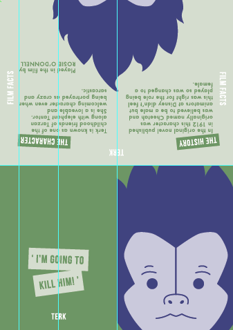
I was relatively happy with the layout used for the Tarzan leaflet as I felt it was highly legible and looked to have structure. Made minor tweaks to make sure each column was equal distance away from the edge, using the margins better. My main issue with the layout of copy was on the other 3 leaflets as felt this was very poor and in some cases the layout not considered at all.

Again looked at making sure the margins were used well and no overlapping of copy onto the image as felt this would distract and confuse the younger audience too much. In some cases I removed parts of the information so that the overall visual appearance of the layout worked better and became more legible.


Repeated the same layout and visual appearance across the other two leaflets to make sure that they were all highly readable and matched across the set.


No comments:
Post a Comment