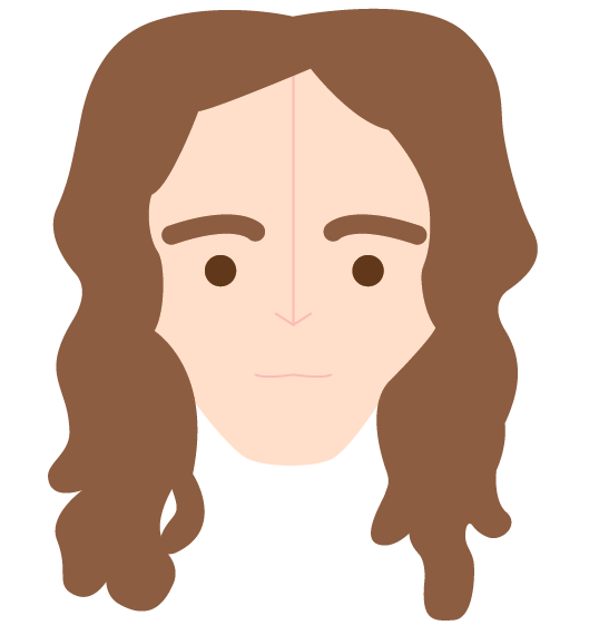
Initially in the process of creating the character illustrations I started by sketching them out ready to work over these with the pen tool and live paint tool on Illustrator. Wanted to make the character simplistic to work with the imagery inspiring me but also easily recognisable. To achieve this I took the strongest elements for the existing characters face and translated this into a simple illustrated style. Elements included shape of the hair, face and eyebrows.


As an alternative option I looked at using the same colour swatches across all the characters to make them work better as a set. Think this works quite well as details and depth are still shown as before but in practice on the poster design this could change.

No comments:
Post a Comment